UX Design Project: 'Fridge Assistant'
This was a personal project that I did back in 2017, that I like keeping in my portfolio as it showcases a range of relevant UX skills, even if the project wasn't game-specific. I wanted to find an everyday problem and "fix" it with a simple mobile app. I've often been frustrated with the way I manage my food at home — either by letting forgotten food go to waste, by going grocery shopping without my list back home, or by simply not knowing what food I already have (or don't have) at home. So I decided to design a food management app.
Feel free to read through all the
steps in the process — or scroll straight down to the end to simply view my final presentation of the process and my findings!
Part 1: Initial research & Defining the problem
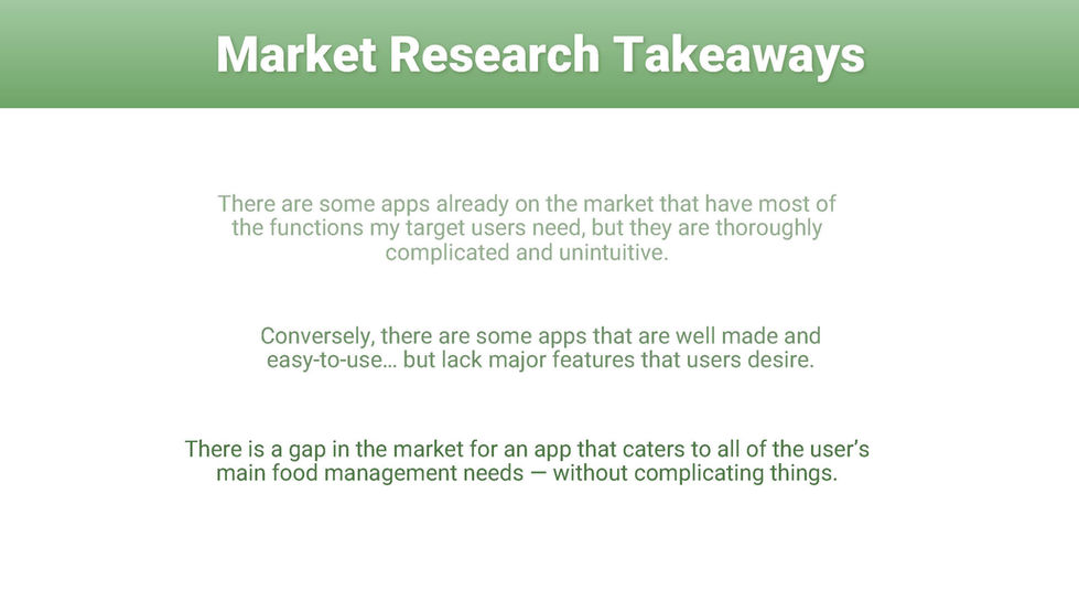
I started off by compiling a competitive analysis of other similar apps on the market; I looked at their strengths and weaknesses, and identified my target market. I then conducted user interviews to learn more about people's food management habits, and used this to define my Problem Statement.
Part 2: Synthesising my research
I organised my findings by affinity mapping all of my post-its (feat. a silly little timelapse because god do I love affinity mapping!) and used what I gathered from this — together with the personas and storyboards I'd created — to create an initial user flow and find my design direction. I listed all of the features I'd want to include, and then prioritised them according to expectation and impact. Having gained some clarity from this and wanting to reduce the scope, I revised the user flow for my minimum viable product.
Part 3: Organisation and basic layouts
With the user flow in mind, I organised the huge amount of information I had collected using key information architecture techniques like card sorting and creating sitemaps, and sketched up a paper prototype for my first "unofficial" user tests.
Part 4: Wireframing and prototyping
Next I jumped into Sketch and created initial wireframes from my sketches. As always, this was an iterative process, and each screen changed shape several times. I annotated them all in detail as well, outlining each section's functionality, on the off-chance that I ever decide to actually develop the app.
Part 5: Usability Testing
Once I was happy with the wireframes, I assembled them together into a clickable prototype. I wrote and sent out a screener, and selected a few candidates to test it on. I recorded each playtest and analysed the main feedback points from each user, and used this to improve the prototype further.
Part 6: Results
An assessment of everything I learned, and a showcase of my process, can be viewed in the images below, or download the presentation in PDF-form here.


